


Mobile checkout is positively transforming the way consumers complete transactions on their devices by streamlining the purchasing process with just a few taps. This movement requires businesses to optimize their mobile checkout process with the aim of satisfying and retaining customers! Capturing this new wave of mobile shopping with future-proof strategies here!
A. The power of mobile checkout
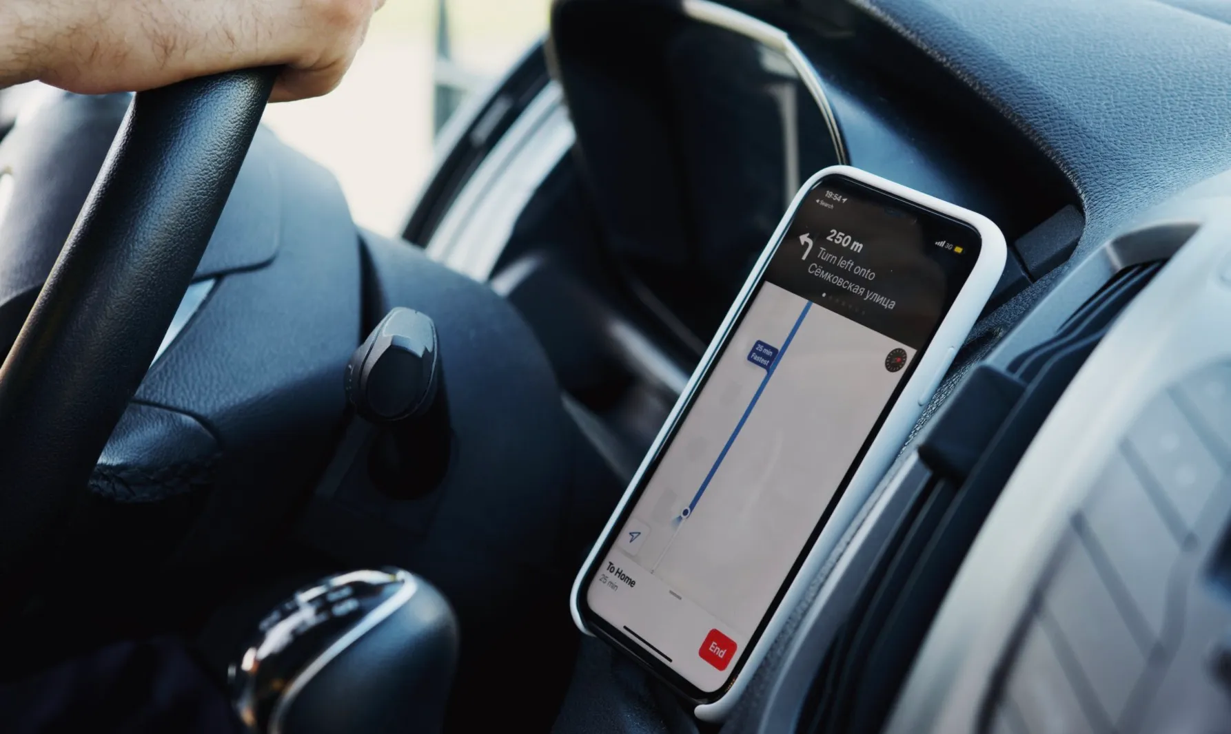
The process of finishing a purchase via a mobile device—such as a tablet or smartphone—is known as a mobile checkout. The thorough concept is to choose a shipping method, double-check the order details, and provide payment information.

B. Optimized mobile checkout: a game-changer for sales
According to the SellersCome, 22% of shoppers leave their carts due to a long or complicated checkout process, and unclear pricing. The data underscores how badly mobile checkout is blowing away potential sales. However, businesses can flip this challenge by prioritizing a seamless and optimized mobile checkout process.
An optimized mobile checkout reduces friction and offers faster and easier ways for customers to complete their purchases. The quicker and simpler it is for customers to check out, the more likely they are to complete their purchases, boosting conversion rates and overall sales.
C. Mobile checkout issues that drain revenue
1. Limited payment options
The more limited the payment options, the less likely customers are to complete their purchases. Without popular methods like digital wallets made up nearly 50% of global e-commerce transactions in 2022, customers won’t hesitate to abandon their carts, reducing trust and engagement in the long run.
2. Distracting elements during checkout
Distraction factors often include additional ads, banners, promotions, or unnecessary navigational elements on the checkout page. These elements, while effective earlier in the shopping journey, can make customers feel cluttered and confused during the checkout process.
3. Complicated mobile checkout process
Long, convoluted, or multi-step procedures such as an excessive number of form fields and unclear directions, are characteristics of a complicated mobile checkout process. This leads to information overload, users may then experience feelings of being overwhelmed and frustrated.
For instance, Shopify’s older multi-page checkout design previously exemplified this issue, as it required customers to navigate through several steps just to complete a purchase. The lengthy process increased cart abandonment rates, with many users dropping off mid-checkout due to frustration or confusion. Shopify has since shifted towards a streamlined, single-page checkout to improve user experience and boost conversions.
4. Shortage of transparent information
In low-converted stores, customers only discover extra charges for delivery, taxes, and fees at checkout after adding items to their cart. This approach can be off-putting, as shoppers might reconsider their purchase upon encountering these extra costs. To them, unexpected fees appear to be considered unwarranted expenses at the final stage of payment.
5. Manual-entry payment
In fact, Shopify’s 2020 research revealed that mobile checkout conversion rates for Shop Pay were 1.91 times higher than traditional checkouts, highlighting the impact of offering faster, automated payment options. The tedious nature of manually inputting long credit card numbers, especially on mobile devices, creates friction that disrupts the smooth flow of the checkout process. This inconvenience will also give customers time to reconsider their purchase or look for faster alternatives elsewhere.
D. Enhancing mobile checkout experience
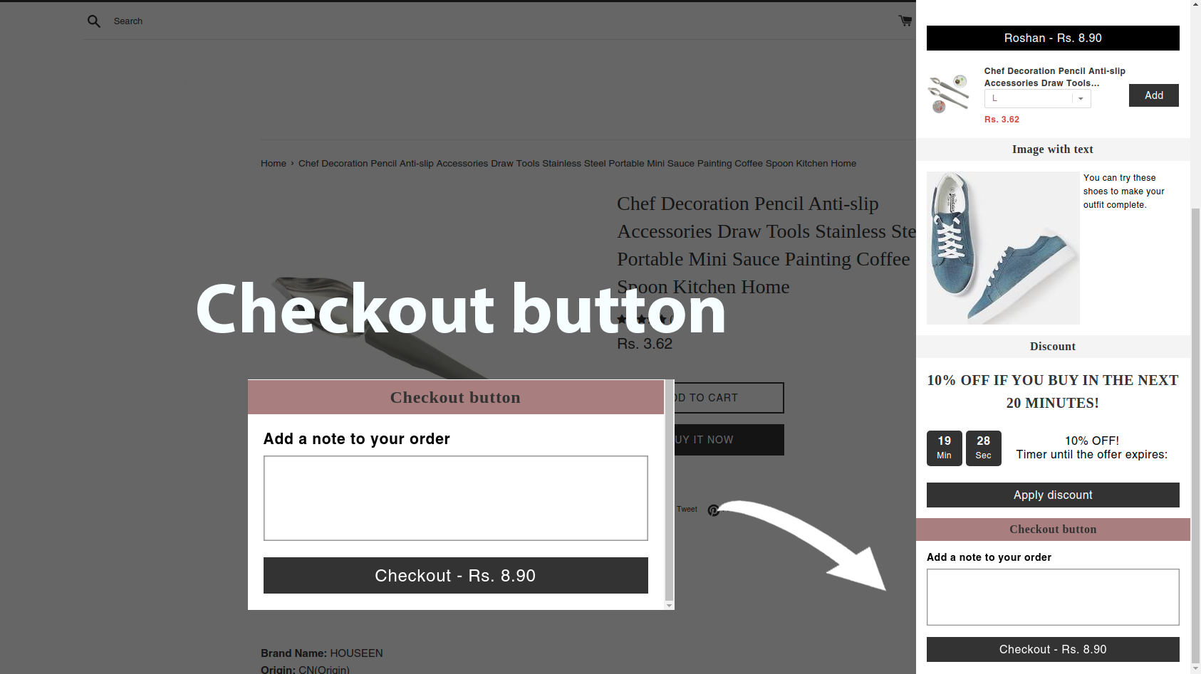
1. Highlight the checkout button
The checkout button must be prominent enough and easy to find, yet it doesn’t need to be overly flashy or distracting. Recommendations:
- Utilize contrasting brand colors
- Incorporate a floating checkout button or keep the cart button visible at the top of the screen
- Position the checkout button above the fold
- Stick it at the top or bottom of the screen
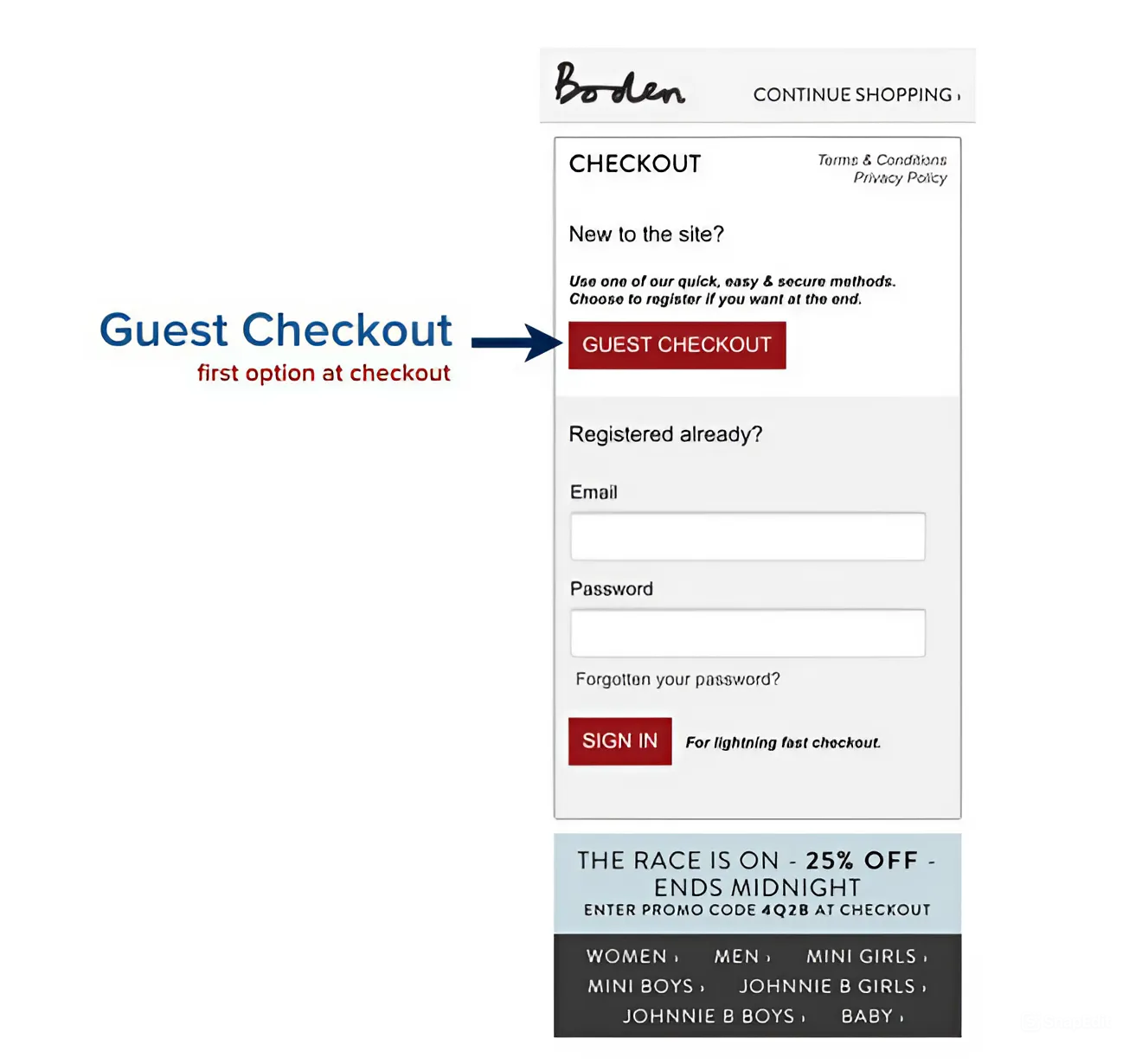
2. Provide guest mobile checkout option
Research from the Baymard Institute reveals that 24% of US shoppers abandon their carts when required to create an account. Many customers, particularly those new to your brand, may be reluctant to share personal information upfront. Avoid potential hesitation at this point by offering a guest checkout option that requires very few details from the customer – namely, just their email address to confirm their order and their shipping address to deliver the product.
3. Offer clear shipping details
Rather than dissatisfying customers with unexpected delivery fees at the final stage of checkout, ensure transparency from the outset. For instance, if there is an additional cost of $5.95 for delivery, communicate it clearly. Likewise, if customers have the opportunity to qualify for free shipping by meeting a certain purchase threshold, highlight this benefit early on.

4. Minimize the number of required fields
Following the KISS principle greatly improves the mobile checkout process given the limited screen space on mobile devices. For instance, instead of providing separate fields for first, middle, and last names, opt for a single “full name” field. Less commonly used fields, such as “Address Line 2,” “Company,” or “Coupon Code,” should be additionally hidden behind expandable links and only become visible when clicked.
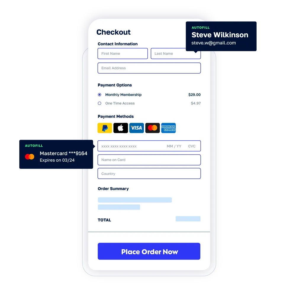
5. Enable autofill or express mobile checkout
Using an autofill feature like Google Autocomplete is an initiative to automatically fill in saved details from a shopper’s Google account. Express checkout options such as Shop Pay, PayPal, or Apple Pay also save mobile shoppers time by eliminating the need to manually enter credit card and shipping details for each purchase. When a shopper first uses Shop Pay, they enter their payment and shipping details, which are then encrypted and stored securely. This information is synced across all devices linked to the user’s account, ensuring that any updates—like changes to an address—are reflected immediately. Security is paramount; Shop Pay employs advanced encryption to protect data during transmission, offers two-factor authentication for added protection, and utilizes fraud detection systems to monitor transactions for unusual activities.
6. Include a progress indicator
Typical steps include shipping, payment, and order confirmation, offering customers a clear sense of how far along they are and a clearer understanding of the steps ahead. Place the progress indicator in a prominent position, preferably near the top of the screen, ensuring it remains easy to track throughout the checkout.

E. Top websites crushing with high-converting mobile checkouts
1. Easton Baseball
Easton Baseball significantly boosted its mobile revenue by 659% after participating in The Good’s Conversion Growth Program, which identified key UX improvements. The program revealed that while most customers were accessing the site via mobile, they were not converting. To address this, Easton Baseball enhanced the product selection and checkout processes by adding a prominent floating “add to cart” button, implementing upsells at the cart level, and offering a guest checkout option.
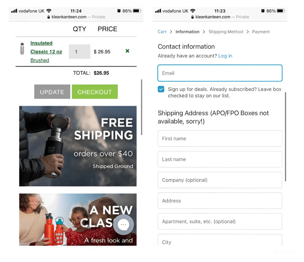
2. Klean Kanteen
At first, the checkout at Klean Kanteen’s website wasn’t mobile-friendly. After a detailed review, the brand implemented a number of mobile checkout best practices to optimize the buying process including eye-catching “checkout” buttons, clear shipping information, and a guest checkout option, which led to an 80% increase in mobile revenue.
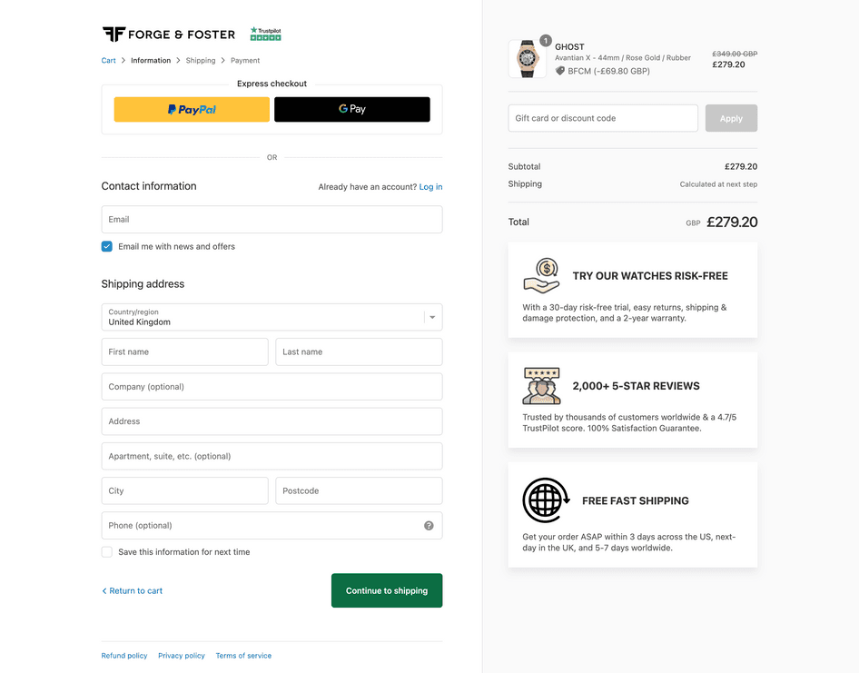
3. Forge & Foster
‘Ninety percent of our traffic comes from mobile, so we work hard to optimize for customers using smartphones. On our checkout page, the biggest improvement came when we added express payment options—that change alone boosted our sales by 10%’ Steve Allen-Founder, Forge & Foster said.
Ready to improve your mobile conversion rates and capture the new wave of mobile shoppers? To take your mobile checkout process to the next level and see similar impressive results, contact Wgentech today. Our team of experts is ready to help you identify areas of improvement and implement improvements to drive more sales and create a slick, friction-free buying process.